
CASE STUDY / CAMPAIGN BRANDING / OOH
LOVE
MONDAYS
A campaign identity and poster system created for Reed.co.uk, built around the idea of making Mondays feel a little more positive.
- Client
- Reedonline / Reed.co.uk
- Role
- Graphic Designer
- Project
- Campaign Branding / OOH
- Deliverables
- Brand Identity / Poster Design
- Tools
- Adobe Creative Suite
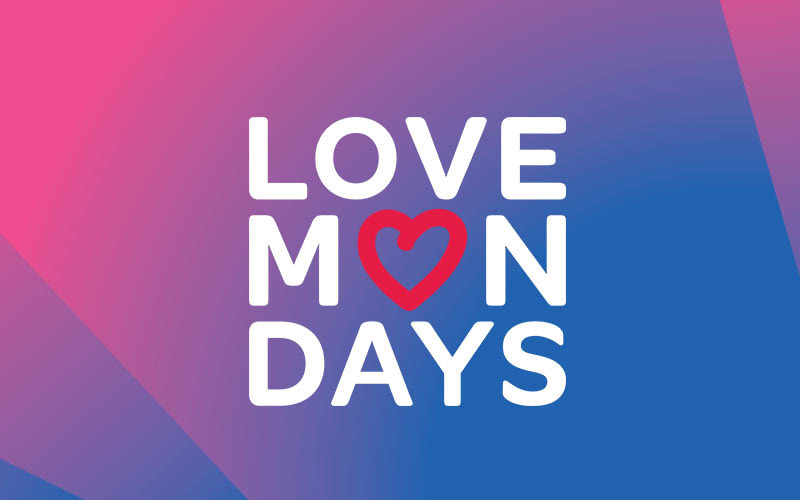
A simple idea, made visible.
Reedonline had a slogan called Love Mondays. I created the branding and poster campaign for the project, developing a bright, flexible identity that could work across public spaces and large-format communications.
The heart became the central visual gesture, replacing the “O” in Mondays and giving the campaign a simple, recognisable way to express the idea.
02. The campaign idea
Love Mondays became both the message and the visual device at the centre of the campaign.
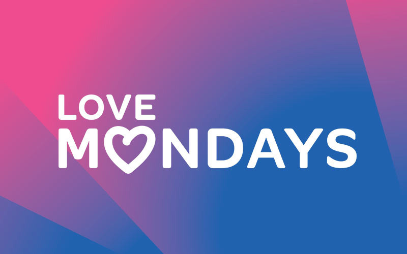
03. Building the identity
A bold gradient, strong typography and a heart-shaped counter create a flexible identity with an immediate point of view.
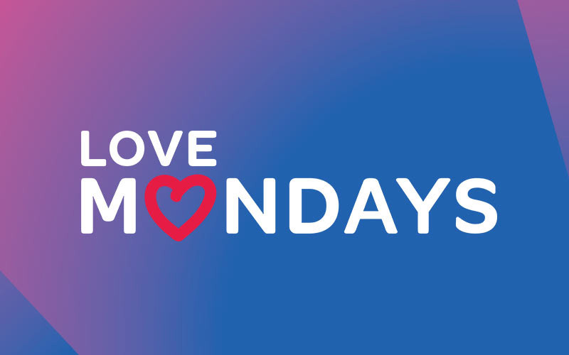
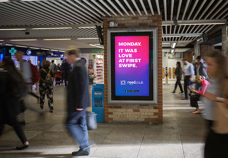
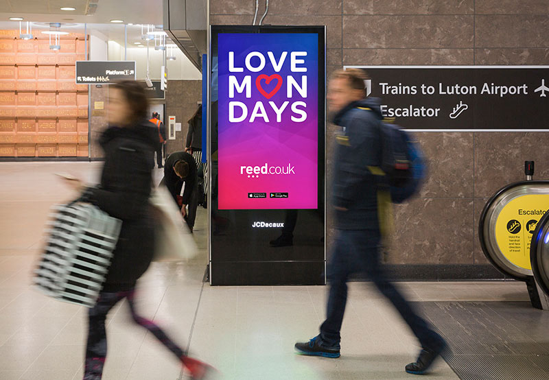
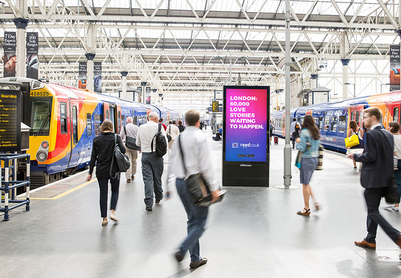
04. Posters for the commute
The campaign was designed for the everyday journey, bringing the identity into stations and the public spaces where a Monday begins.
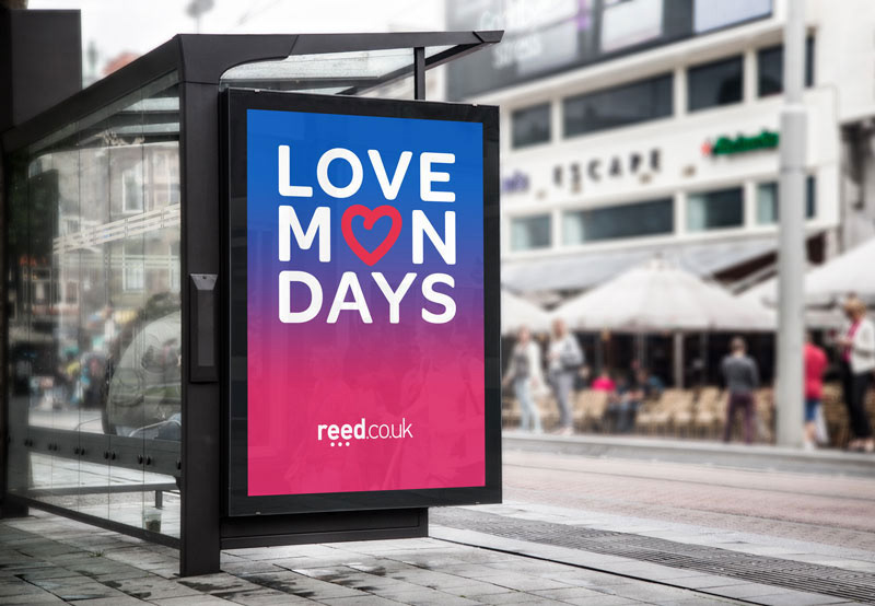
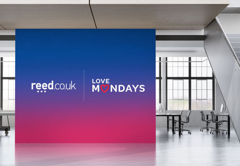
05. From screen to street
The same visual language scales across bus shelters, digital OOH and interior environments, keeping the message clear wherever it appears.
A bright campaign identity for changing the tone of the working week.