
CASE STUDY / BRAND REFRESH
mjam
A fresh visual identity for mjam, built around food, movement and a simple idea: everyone smiles with mjam.
- Client
- mjam
- Category
- Brand refresh
- Scope
- Identity · Illustration · Motion
- Role
- Motion Designer / Illustrator
A brand refresh with a little more appetite.
mjam’s refreshed identity brings more colour, warmth and movement to the everyday act of ordering food.
The system is designed to flex across brand, product, social and real-world touchpoints, keeping the smile at the centre while giving the identity room to move.
01. The Idea
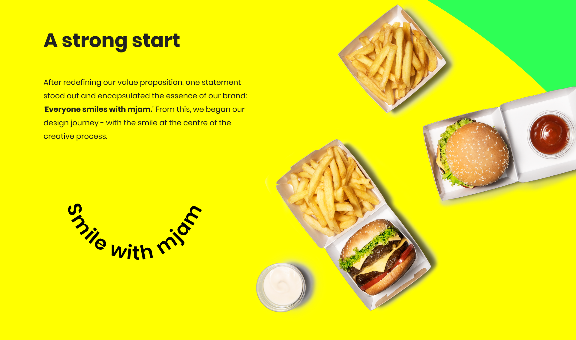
One thought became the emotional anchor for the refreshed identity.
02. Refreshing the identity
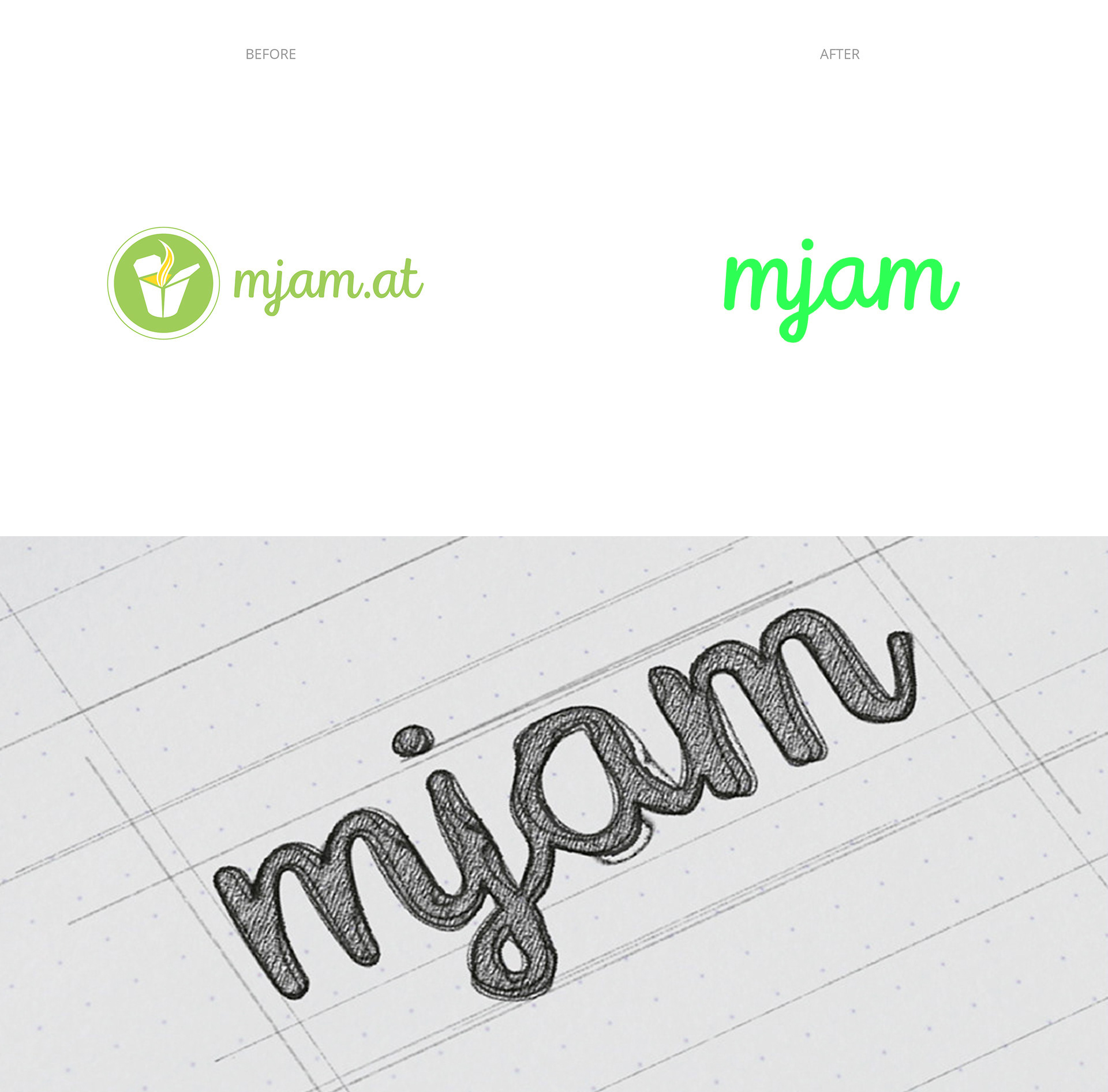
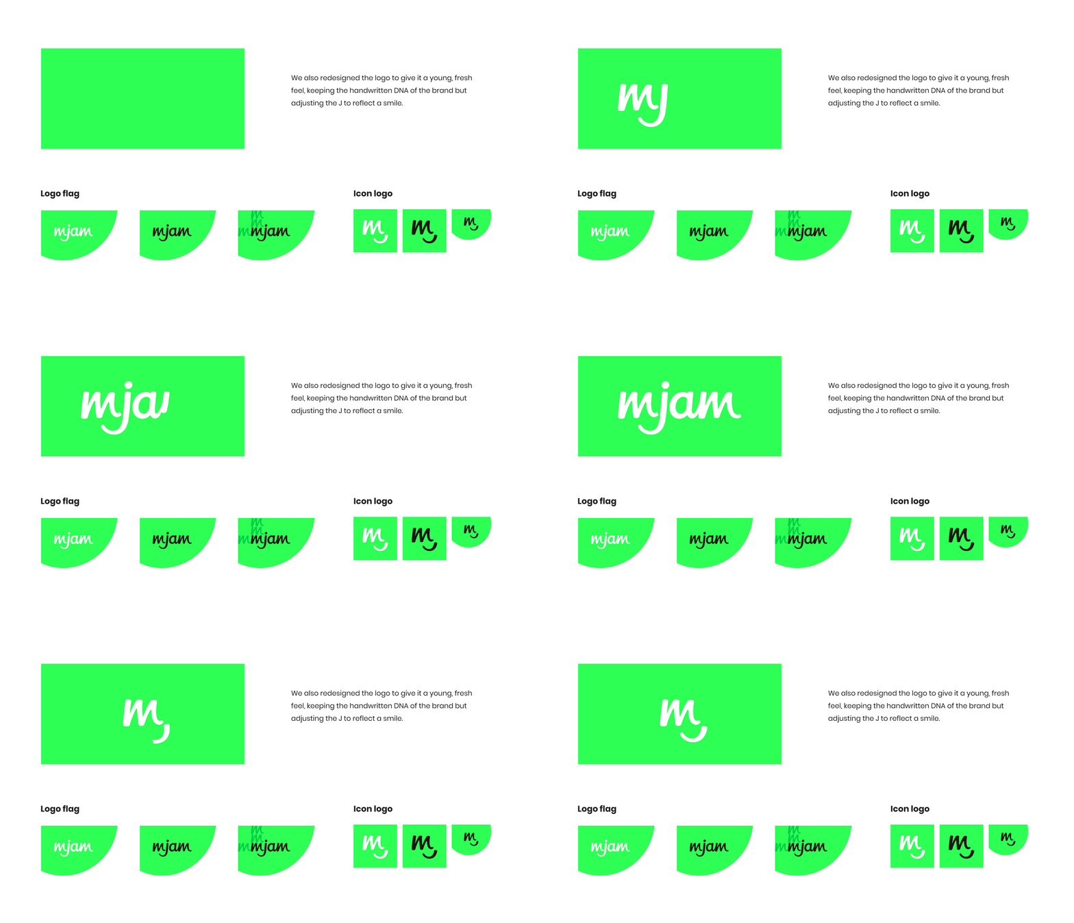
The mjam mark was developed into a more expressive set of shapes, flags and symbols.
03. Smile system
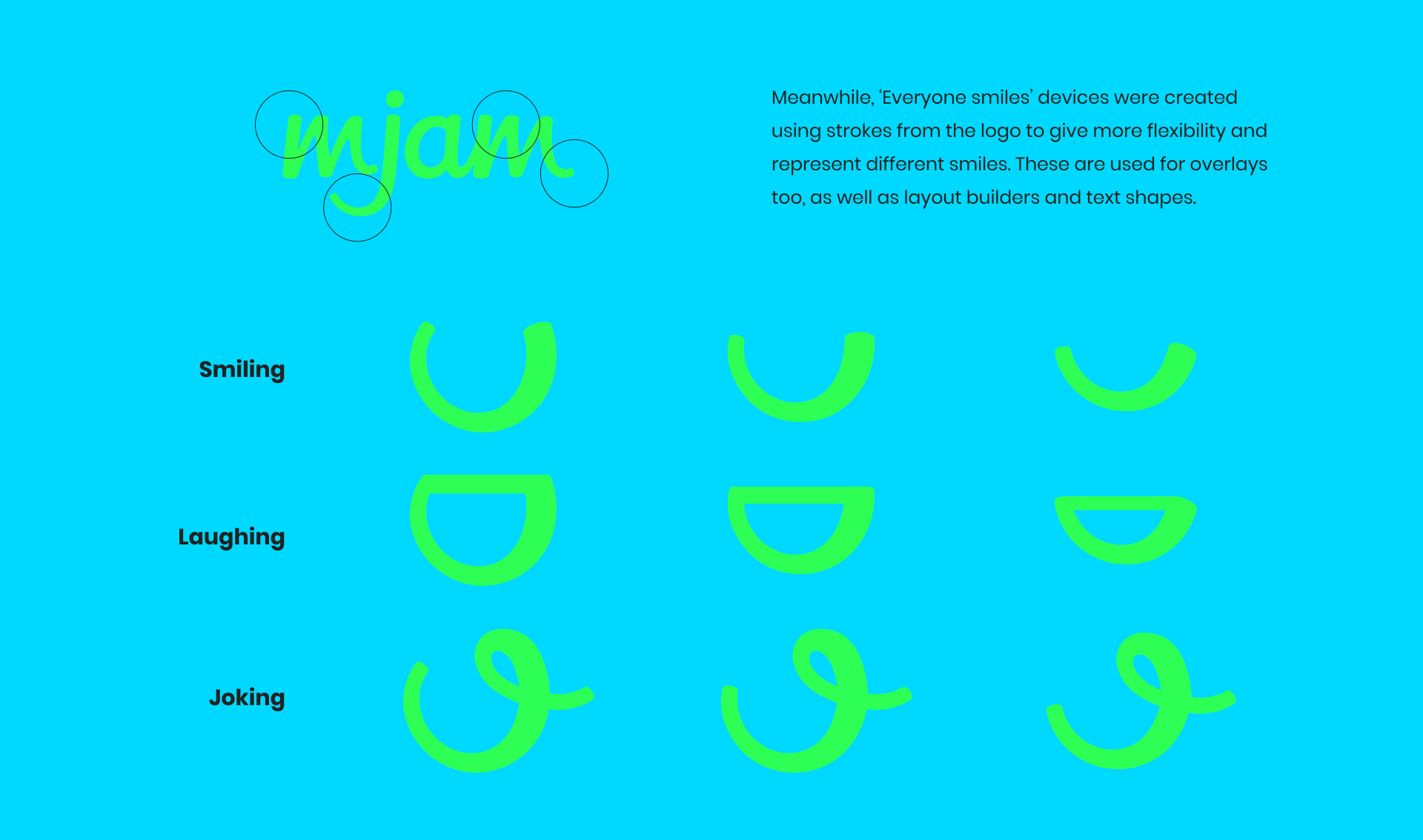
The smile works as a graphic device, a gesture and a way to connect the brand’s many expressions.
04. Colour
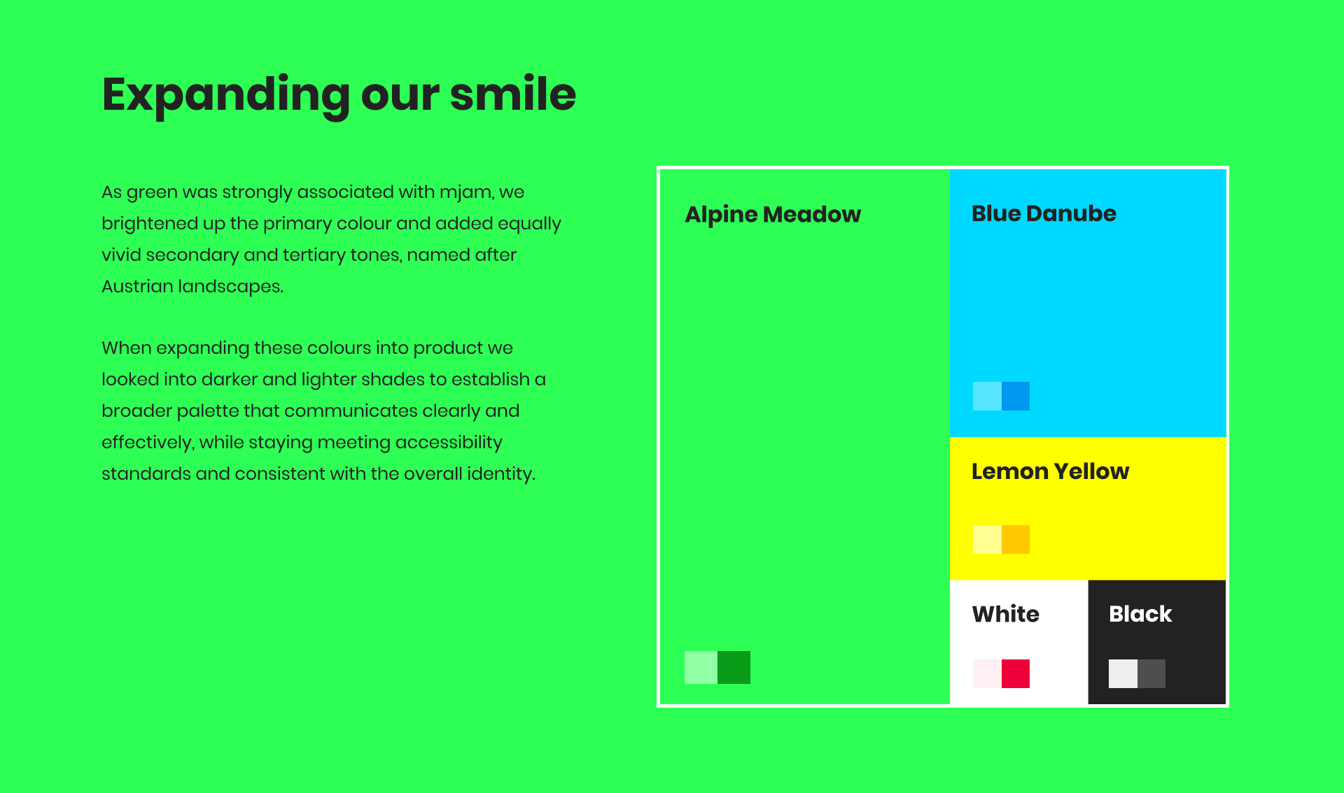
A bright, flexible palette gives the identity energy while keeping the system recognisable at every scale.
05. Illustration
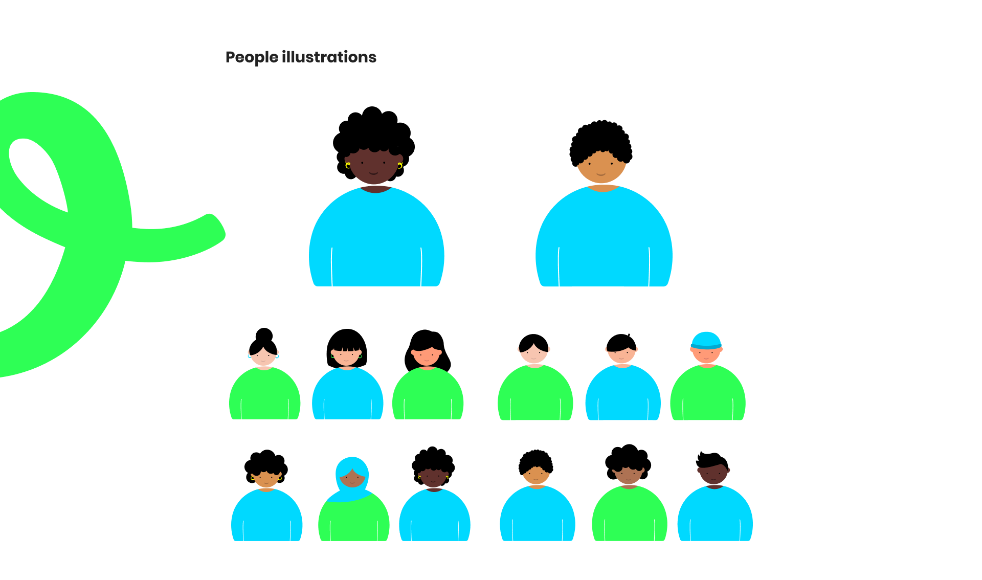
Food, people and delivery become a playful visual language with a generous sense of scale.

06. Iconography
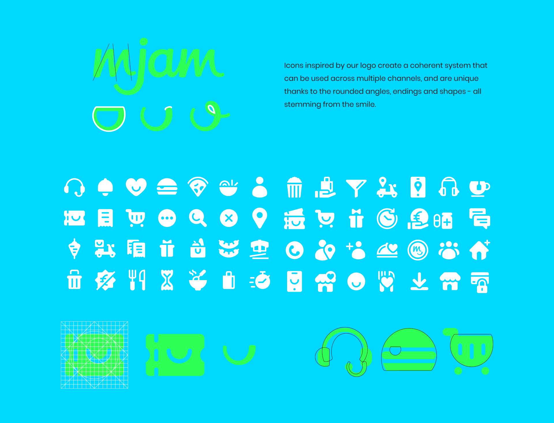
A simple icon set gives the brand a useful, ownable shorthand across product and communications.
07. Motion
The system comes alive through bold transitions, looping shapes and a smile that can travel from frame to frame.

08. Real-world applications
The identity is built to meet people where the brand lives, from delivery moments to physical spaces.

09. Social & Digital
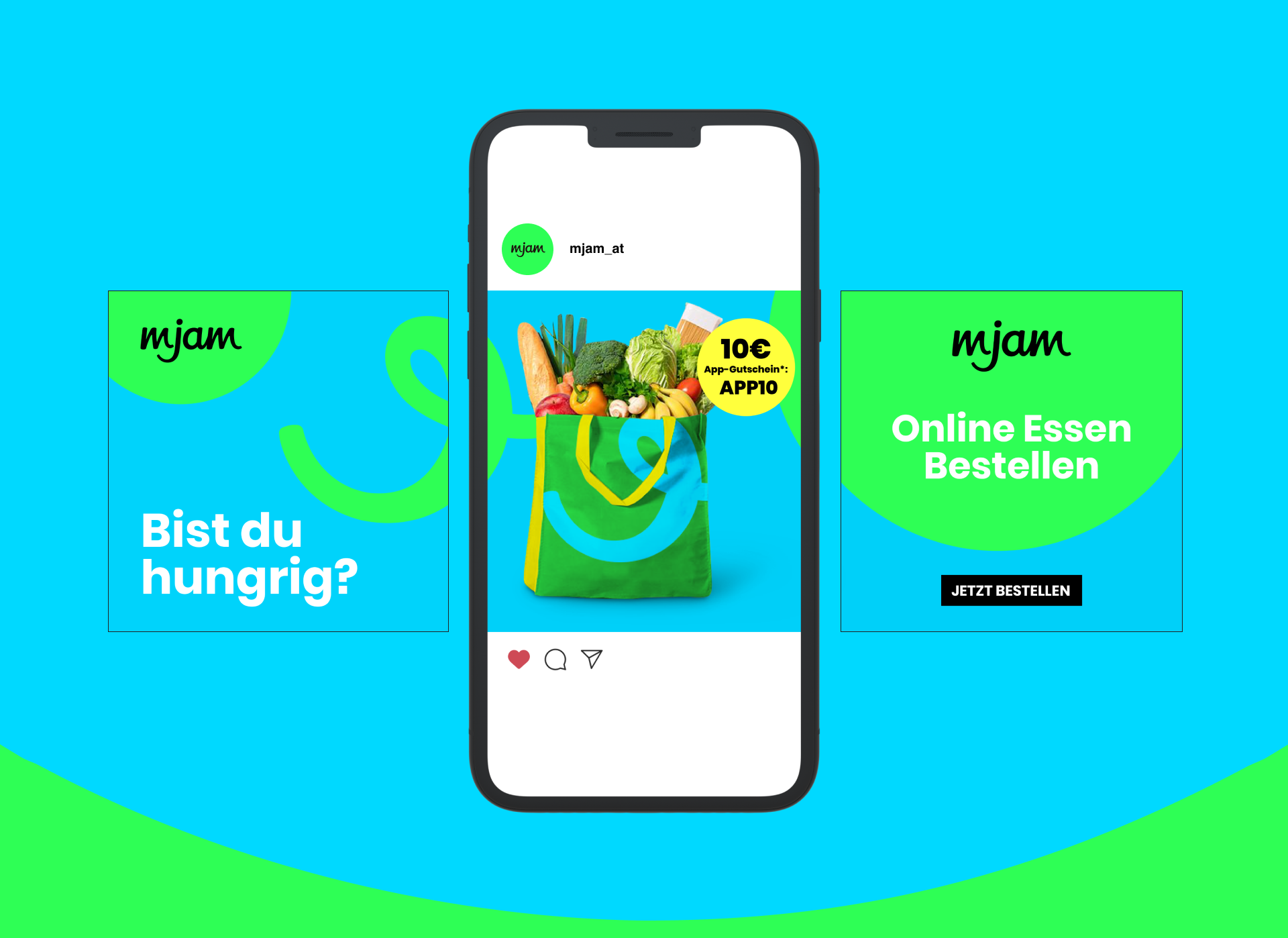
Flexible layouts and a high-contrast palette help the system stay clear, immediate and unmistakably mjam.

Thanks for stopping by, we hope we made you smile.